What Makes a Good Park? Part 3
Parts 1 and 2 of this series dealt with some analysis of public space. What is a well-designed park, square or plaza? What makes some work and others not as much? Why is this even important? The obvious next question is – what can be done about it? Knowing what we know today, what should we do differently? That’s what will be addressed in this piece.
First, to reiterate. Well-designed public space, whether it’s parks, plazas, squares or streets, are critical to life in a city. If we don’t have attractive and useful spaces, people won’t ever walk, ride bikes, or take public transit in any significant numbers. This is important if you care about the life of our cities and towns, their ultimate success, and especially the revitalization of places older than 60 years.
Having a vision is great. Getting the zoning right is critical. But, without the right attention to the space outside the building, and without quality spaces for socializing, our cities and towns will fall far short of their potential.
In this piece, I’ll focus again on Kansas City, and what can be done to remedy some of the flaws I identified in Part 2. But, this is not just about Kansas City. Numerous cities across America were developed with a very similar approach to park and public space design. The City Beautiful ideals practiced in Kansas City were widely utilized, in places like Omaha, Dallas, Denver and many more, both large and small. Many of these same propositions could be implemented elsewhere.
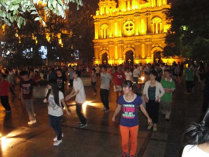
The overriding message I’d like to convey is that we need to more highly value the daily integration of parks and plazas, not the occasional recreational or rural image of parks. It’s the daily social life of cities (as William H. Whyte used to describe it) that makes them desirable places to be.
How do we better value them? By focusing on two key facets – design and location. When it comes to design, simpler is always better, as it’s often the most simple, “boring” park designs that get the most use. Let people program the space themselves, and keep your designers restrained. Focus on those key elements that Holly Whyte emphasized in his work.
But location is another matter. Too often, we’re saddled with parks and public spaces in the wrong place. For neighborhoods and cities to thrive, public spaces absolutely must occupy “prime” land that could easily be developed. Their function should be placed in the primary role, not secondary to land that could have buildings on it otherwise.
In Kansas City’s case, a look at some specific cases helps to point the way towards what could be done, given the will to do so.
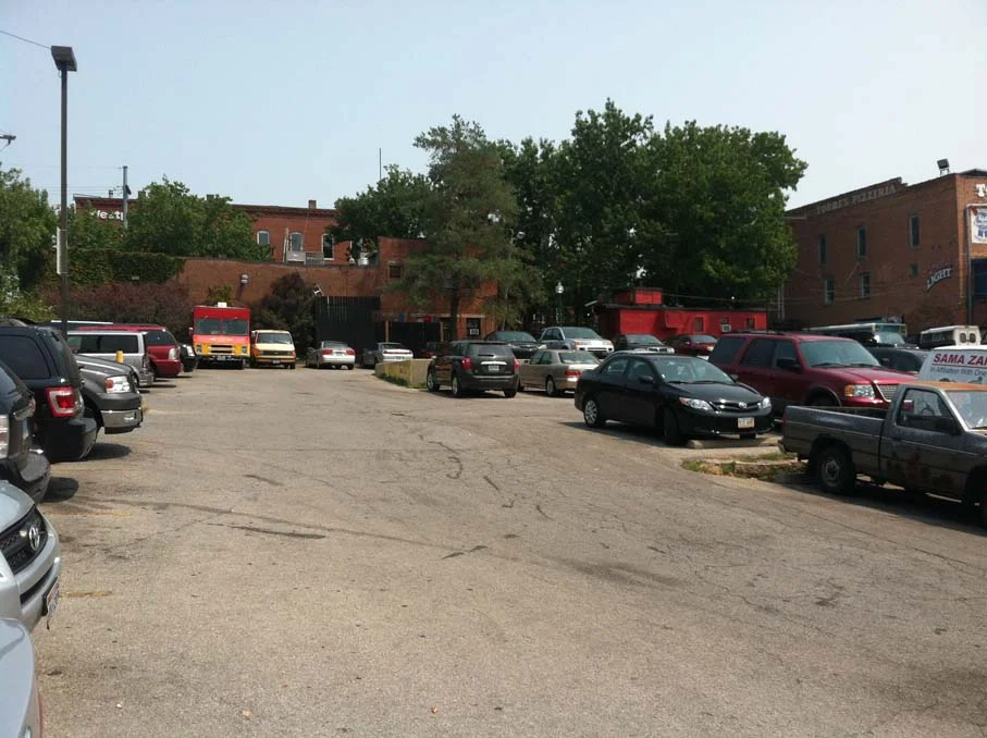
Westport, a generally successful entertainment / neighborhood center, lacks a true gathering space. A redevelopment from the 80’s called Westport Square actually is not near a square of any kind. And yet, directly in the middle of the area sits a large amount of land, lying desperately in wait for people to use it. How is the space used now? Sadly, it’s a parking lot. And not just any parking lot – a free parking lot. The land is valued so little that people aren’t even charged anything to park here. Imagine if the middle of Westport actually had – a square, surrounded by buildings that faced it, and parking moved off to the perimeter. Imagine live music in the middle; people having lunch outside in a dignified space; and a space for viewing some of the oldest buildings in the city without worrying about traffic.
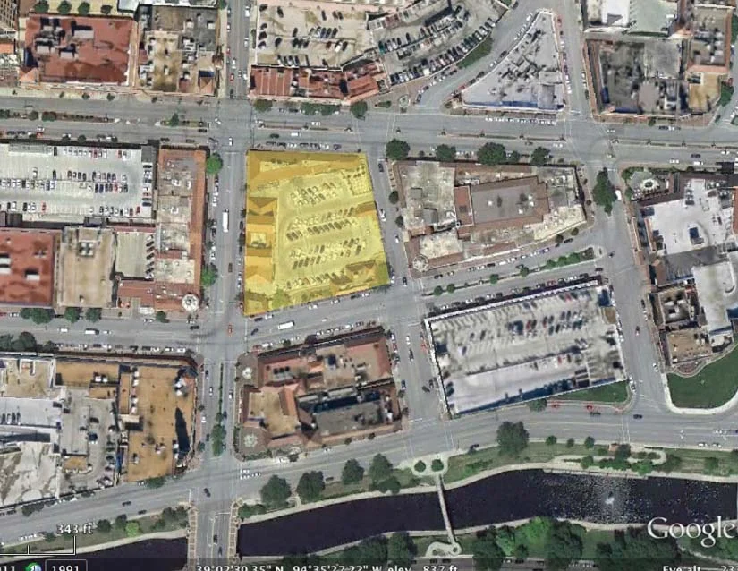
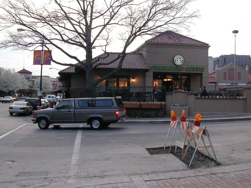
Next up: Country Club Plaza. Imagine this – what if the Plaza actually had – wait for it – a plaza?! This landmark piece of Kansas City is excellent in most respects. But one area that it disappoints is that there’s no outdoor gathering space of any substance, except for Mill Creek Park on the edge. And, accessing the park requires crossing busy and fast-moving Broadway Boulevard. However, in the midst of the Plaza is a space that is nothing more than one-story buildings and the top of an underground parking garage. I’ve often used this block as a good example of how to line a parking lot with simple one-story buildings. But what if this block instead was a true public plaza, with built edges that were more permeable to bring people into it. In fact, the edges could even grow taller in time, creating a stage-set of sorts that would feel like a smaller version of the Plaza Mayor in Madrid. Using quality design could draw people into an unsuspecting space of beauty and grandeur. Simply imagine the uniqueness this space could present, and how well-used it would be. Design: tricky, but talented people could definitely solve it, and with an overall minimum amount of short-term changes.
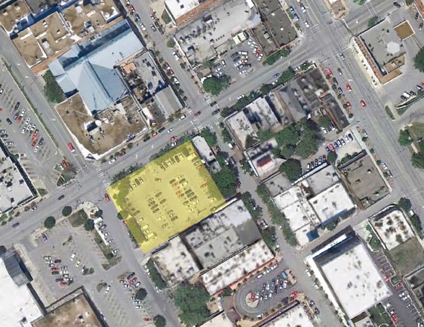
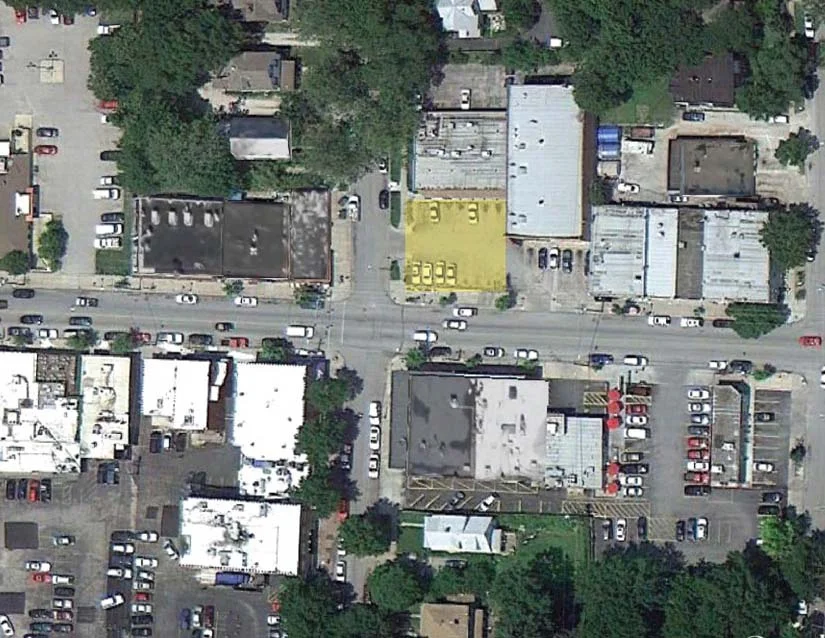
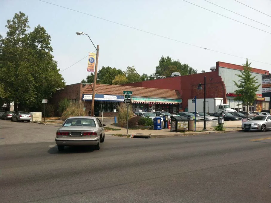
Another Midtown example, on a smaller scale, exists in the Volker neighborhood near 39th Street and Bell. This neighborhood center is a main-street style strip of shops along 39th Street, supported by the residences around it, as well as KU Med Center. An unfortunate suburban-style building at Bell Street actually reveals an opportunity for this neighborhood. The parking lot on the corner has a small number of spaces dedicated to the strip mall that sits behind it. Now again use your imagination, and picture this as a public square, with a new, larger building behind it. The space would instantly create far more value, and provide some much-needed space for people to just sit and enjoy the neighborhood. As a major destination for foodies in the area, just imagine the ability to sit outdoors here in an attractive space and eat. The cost: about 16 parking spaces (plus 6 for the building next door), some landscaping and sweat. The long-term benefit: immeasurable.
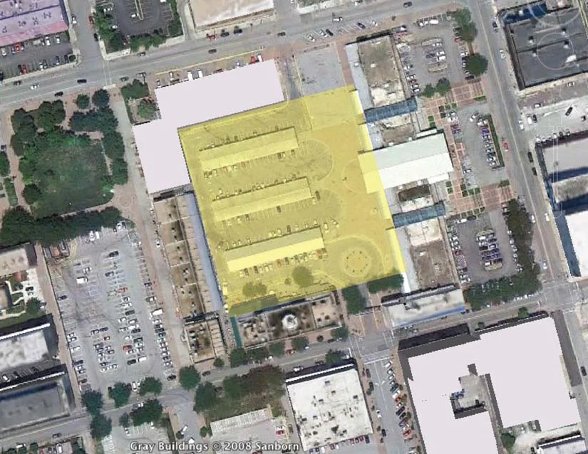
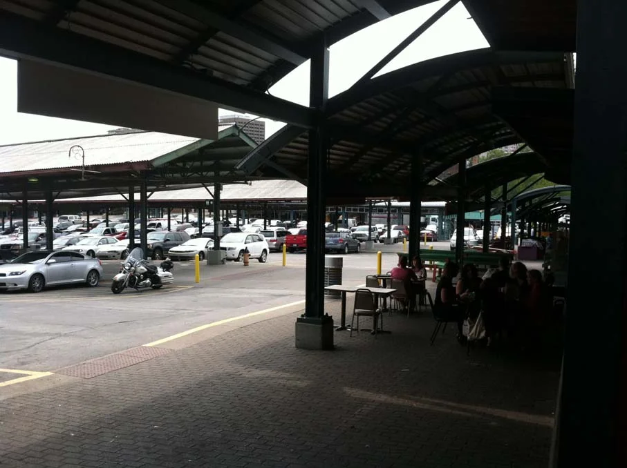
The City Market area provides a final example. The market itself provides an vital and entertaining function for the City. Interacting with the merchants, visiting on market day, etc is always an enjoyable mix of chaotic and interesting. The problem is, it’s only truly used that way on one day per week. The other days of the week, the central portion of the City Market is nothing more than an ugly parking lot and series of driveways. A few simple changes could tangibly change how the whole market works, and additional future improvements can spice it up. First, make the central portion of the market a true square, with no vehicles allowed. Second, open up Main Street again to through traffic. Third, re-work the parking areas and the sad little park along 3rd Street so that circulation is better and market-day vehicles can be accommodated. Some creative thinking about how vendors can load, unload, store and sell their merchandise on market day can make this a better space on a daily basis, year-round.
In real terms, some of these improvements are quite easy – they involve almost no true demolition and reconstruction. Others require some long-term effort and thinking. They all could benefit from the kind of thinking that goes by the name Tactical Urbanism or Build a Better Block. And, this is just a beginning – certainly other neighborhoods and parts of the city could benefit from this approach.
In a broader sense, these examples outline a 21st century approach to public space in our cities. The approach acknowledges that we’ve done some things well and others not so well. We have some excellent legacies from the past, but a great deal of those remnants don’t serve us well, or were designed with something else in mind. For our cities to succeed long-term, we must put people and sociability at the forefront of our decision-making. It’s not good enough to have some green on a map, or to build a bike lane or two.
The final part of this series will return to the big picture, and explore an overall theory for public space, and some further strategies on how to get there. As a teaser, consider this a recipe for your own community:
Mix In:
One part of Parks, plazas and squares in places where they’re needed
One part of true bicycle infrastructure, including bike boulevards, cycle tracks, bike sharing and bike parking
Two parts of ubiquitous Complete Streets
Flavor to taste: the Removal of high-speed roadways in the middle of cities, and knitting cut-off neighborhoods back together
Stir these up, bake at a high temperature, and savor the results. You won’t be disappointed.
If you got value from this post, please consider the following:
- Sign up for my email list
- Like The Messy City Facebook Page
- Follow me on Twitter
- Invite or refer me to come speak
- Check out my urban design services page
- Tell a friend or colleague about this site

