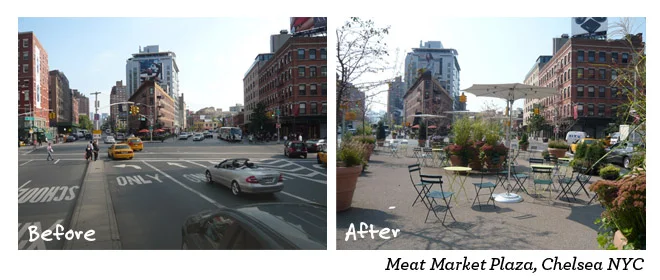
Image by Project for Public Spaces
I admit it: I really hate all of the variations of SoHo and TriBeCa that cities across the country have used to try and brand their own neighborhoods. For one, the idea of branding every single place or collection of a few buildings is just tiresome; but secondly, must we always copy New York? Not everything that works there will work in other cities. In fact, more than likely what works in New York only really works there - it's a unique animal in American cities. So forget your High Lines, your shards and your rent control. Get the basics right, first.
So, where can we turn to then to learn the basics? Well of course - New York! And Paris. OK, ok, before I get slammed with emails, this time I actually mean it. Clemence Morlet of Project for Public Spaces compares some simple fixes both cities have undertaken in recent years to improve the pedestrian environment. What's great about this - nearly any city of any size would do well to apply these lessons. Here's a quote, but I suggest you read the piece and check out the before/after images:
However, some amenities cleared off from the sidewalks are relocated on former parking strips. To enhance even more street activities and uses, the reuse of some parking spaces gave the opportunity to add amenities openly requested by Parisians such as café terraces, benches, greenery, fountains, or bike racks. This form of Placemaking makes for an even more comfortable pedestrian experience.
...
The reallocation of space is mainly done with painting on the pavement, allowing pedestrian plazas to be built in one weekend (Pearl St plaza in Dumbo, Brooklyn, 2007). However, it responds to design guidelines gathered in theStreet Design Manual NYC DOT released in 2009. This report of more than 200 pages gives detailed instructions and guidelines on geometry, materials, lighting and furniture for safer roadways, lanes, sidewalks, plazas, etc. These transportation engineering streetscape designs have considerably enabled public realm activation and users to feel more comfortable in the streets.
The 59 small and large public plazas created by NYC DOT since 2007 are great showcases of street redesign that enable public and economic activities. After applications from local communities, NYC DOT works together with them to create temporary to permanent public plazas using spaces formerly dedicated only to motorized vehicles. Those outdoor places offer spaces to stay for New Yorkers welcoming them with colorful movable tables and chairs, sunshades in summer, and greenery. Post-project surveys show the plazas are mainly supported by New Yorkers (up to 72%[7]) and 76% of New Yorkers live now within ten minutes of open space (up from 70 in 2007[8]). Moreover, the improvements generally resulted in an increase in retail sales at locally-based businesses; like in Pearl Street in Brooklyn where local retail sales have increased by 172%, compared to 18% borough-wide[9].
And also, let's not forget what we can learn and apply from Big D. Clarence Eckerson, Jr. highlights the excellent work of Jason Roberts and The Better Block on its fourth anniversary with this short film:
If you got value from this post, please consider the following:
- Sign up for my email list
- Like The Messy City Facebook Page
- Follow me on Twitter
- Invite or refer me to come speak
- Check out my urban design services page
- Tell a friend or colleague about this site

