What makes a good park? Part 1
I’ve written before that cities are not statistics. In that particular case, I was talking about how we can quantify various aspects of a city or neighborhood, but that those numbers tell us very little about life - the actual experience on the ground, whether people will walk and what kind of economic success it might have. While it frustrates the rational mind, it’s better to start with looking at human behavior, psychology and even sociology. For example, the notion of Walk Appeal. Our collective fascination with numerical analysis extends to park design as well. Standards-making bodies tell us how much park space a city should have, in what configurations, and with what amenities. It’s as if we could simply follow these rules and have successful, well-used parks and public spaces.
Of course, the real world provides no such comfort. Our public spaces vary tremendously in their success – how well they are used, how much they impact adjoining property value, and how much they contribute to people walking or biking.
Parks or plazas of similar sizes show wildly different amounts of usage and success. City officials and residents are often left wondering, why does one park work well when another does not?
Of course, design of the park itself matters. No one has written better about this than William H Whyte, who is discussed in this excellent blog post regarding Brewer Fountain Plaza in Boston. Whyte, like any good researcher, actually studied how people use space, instead of solely relying on design theory. One could say that he excelled at studying humans in their native habitat.
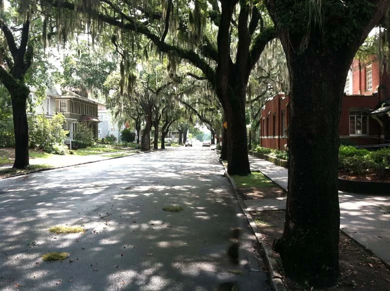
And while Whyte is spot on with those specific criteria for the park/public space, there are a few other bigger-picture criteria from urban design that impact success. For this particular post, I’ll use Savannah, GA as a case study, with its famous Oglethorpe-designed master plan. The primary object of my analysis is Forsyth Park, the largest park in the historic district – not one of the 22 squares that the city is most known for.
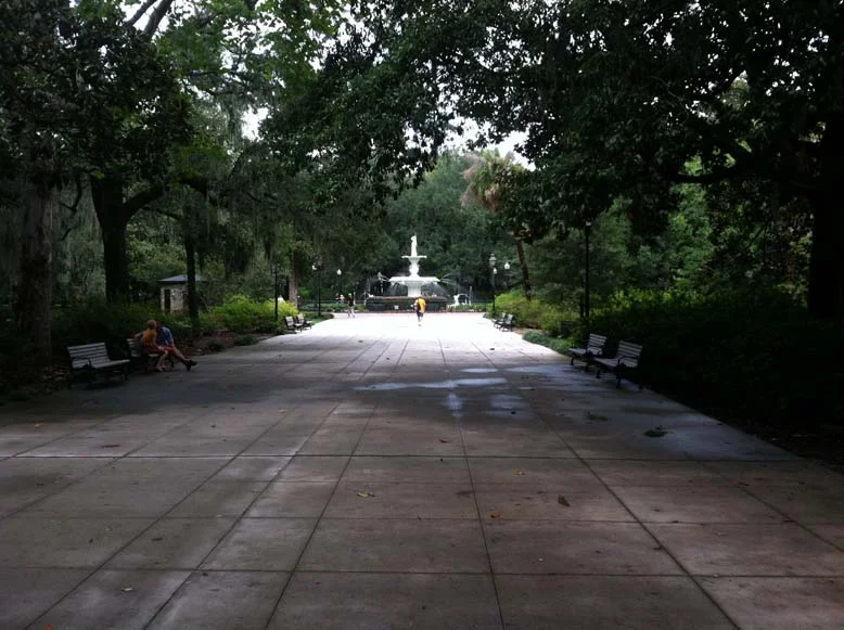
For a couple of years now, I’ve not only used Forsyth on a nearly daily basis, but observed how others use it, and how it functions in the community. The park is arguably one of the five or ten best urban parks in America, in my opinion, and a guiding example of how to do it right. While the park certainly nails Whyte’s criteria (water, food, trees, triangulation and much more), it’s how it fits into the larger picture that interests me most. For example:
Location, location, location. So many parks, even ones that have great facilities, are on “left-over” land that was too hard to develop or wasn’t’ in a prime location in the community. In Savannah, Forsyth Park and the squares were integrally-located as part of the neighborhoods, or Wards in this case, as the city developed. So many cities took the opposite approach, as I’ll detail in subsequent posts. This particular land was not an afterthought – it was consciously designed as part of the necessities of living in a city.
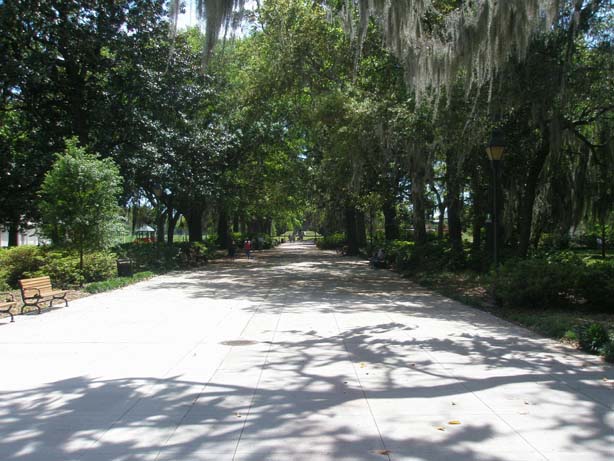
Location along key pathways. Again, Forsyth Park is instructive. Located along the axis of Bull Street, Forsyth is on a key spine of the city, extending from City Hall south. The walkway through the middle is a straight shot into the heart of downtown. It’s logical and easy. Residents or visitors can walk from one end to the other without having to worry about sense of direction. Because if its location along this key spine, it encourages casual walking or biking, since the beauty of the park enhances the walking experience.
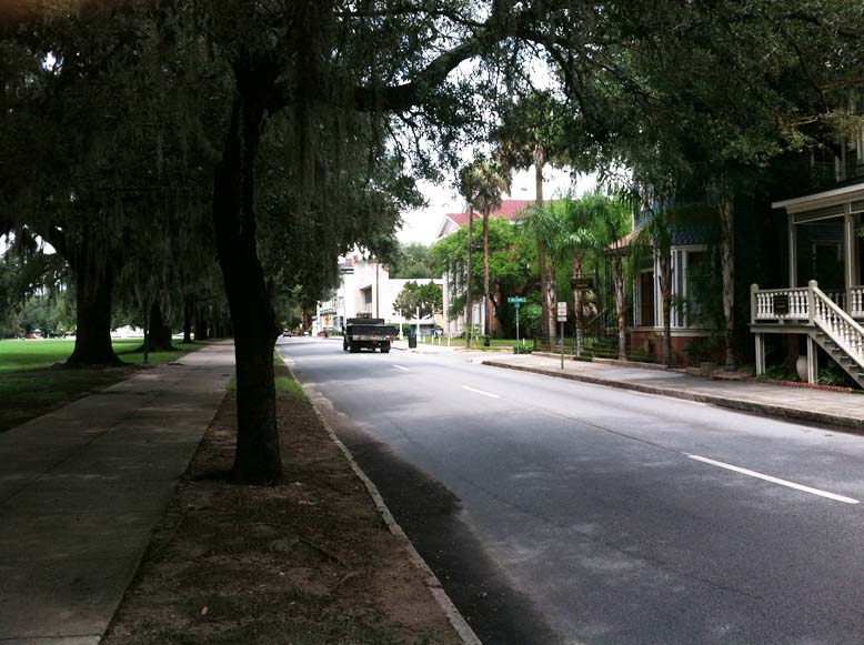
Integration with the surrounding streets and buildings. While Forsyth is bounded by two streets on the east and west that are one-way, and have traffic that generally moves far too fast, the streets themselves are not wide. This makes them easy to cross for pedestrians, in spite of the high traffic speeds. And, around the park are located small businesses, hotels, bed and breakfasts in addition to the many residences. The park does not feel as though it’s set apart from the neighborhood – it feels as though it’s distinctly part of the neighborhood.
Public space, what we call the “public realm” in planning wonk-speak, is the key element in whether or not people actually walk. The streets, plazas, parks, squares and other public spaces must be thoughtfully designed. Public spaces should be well-located as well, or they simply will not be well-used. Forsyth Park has all the elements Whyte described eloquently, including a vast amount of simple, open land that can be programmed by its users on a daily basis. These things are not easily quantified, but are certainly observable through the study of human behavior. As we consider retrofitting public spaces or building new ones, we are best served by keeping our desire for quantification in check, and looking harder at how design and behavior intersect, whether that’s the scale of a simple playground or an entire neighborhood.
In the next post, I’ll examine Kansas City’s famous parks system designed by George Kessler, and how those parks rate via this criteria.
If you got value from this post, please consider the following:
- Sign up for my email list
- Like The Messy City Facebook Page
- Follow me on Twitter
- Invite or refer me to come speak
- Check out my urban design services page
- Tell a friend or colleague about this site

