Dude, that's bru-tal
I’ve never understood the fascination so many architects have with the “brutalist” style of buildings that some designers loved in the 1960s-1970’s. Even in the haze of youth in architecture school, I found that particular style unattractive, to put it kindly. I suppose when a style is coined “Brutalism” you should expect that it will deliver something unpleasant. Most people think of the word brutal as related to something cold, unfeeling or harsh.
I particularly like what Urban Dictionary says
brutal: can be anything from hit in the balls to a slap across the face, or used to explain metal bands.
So maybe we should call this “Hit in the Balls-ism?”
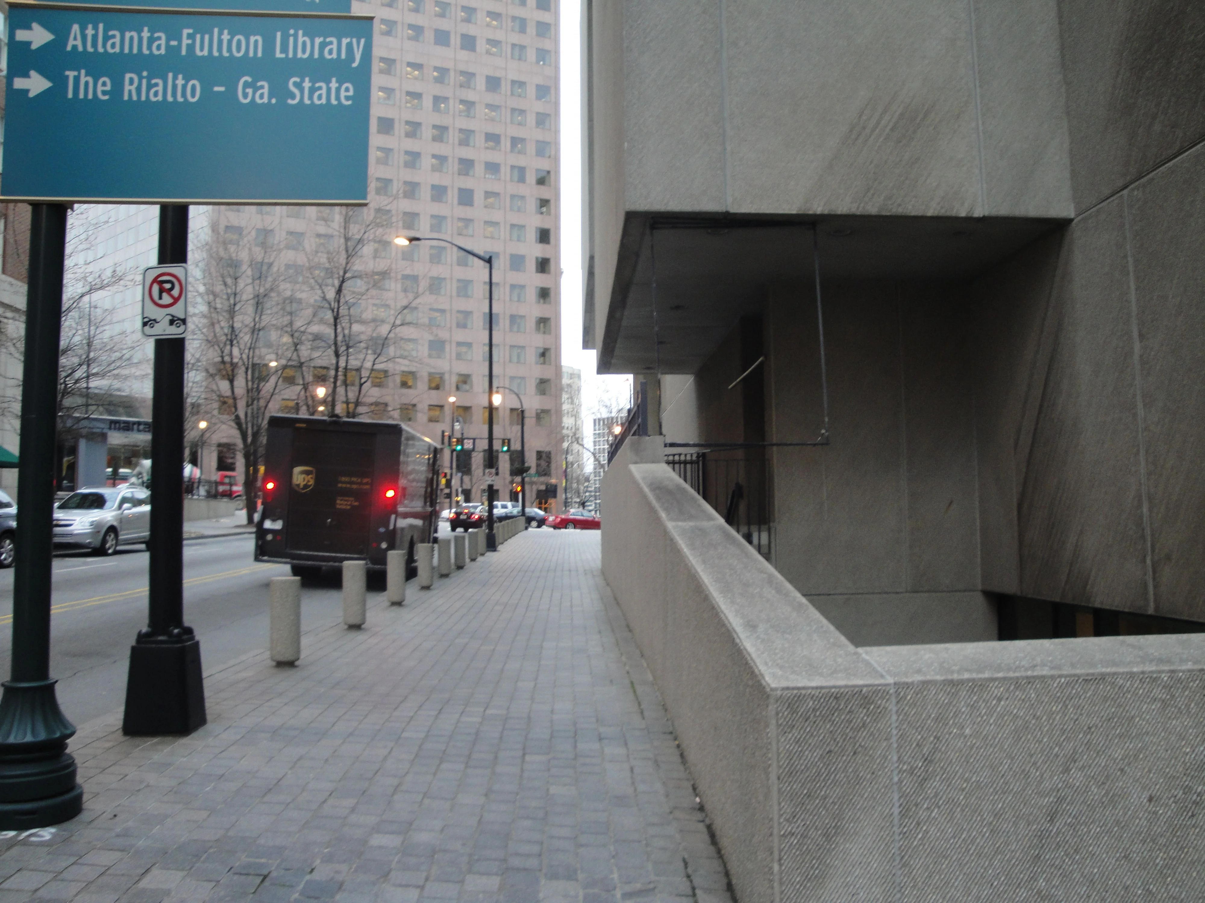
Most cities of any size have at least one significant building designed in the brutalist style. I was reminded of the style most recently on a visit to Atlanta, when confronted with the Atlanta Central Public Library.
Atlanta Central Public Library, completed in 1980, is Marcel Breuer’s last building. It’s considered a masterpiece by a number of architectural historians and architects. Here are some images of it.
Here’s an image of the Carnegie Library that it replaced.
It’s one thing to design ugly buildings. After all, it’s possible to have a healthy debate about what is ugly and what is not.
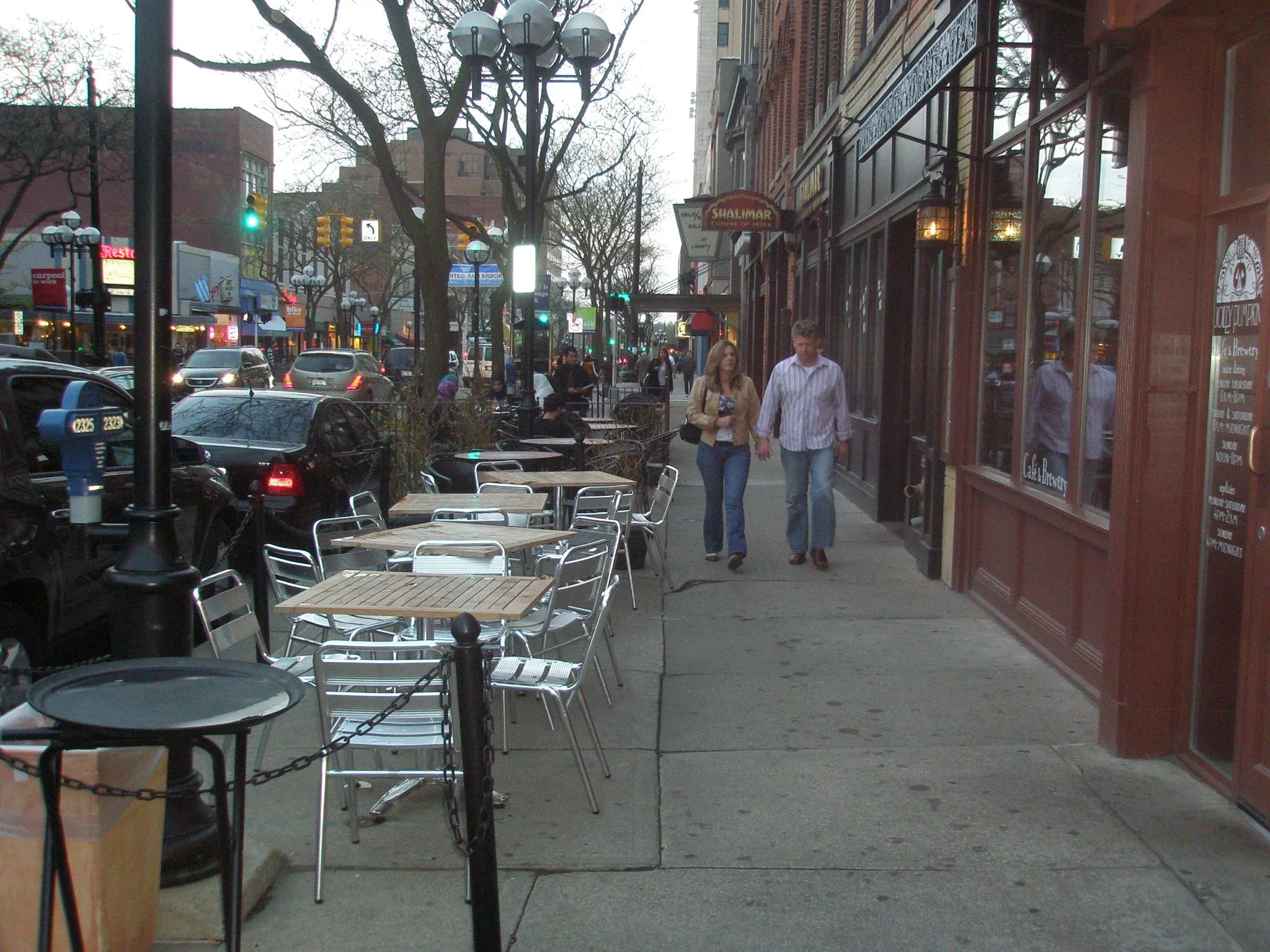
It’s a whole other thing to design buildings that are so destructive of street life. Most brutalist buildings, like this library, are harsh to the passerby on purpose. They are inhuman on purpose.
And yet, somehow we accept this. Architects often celebrate it. For me, it’s inexcusable.
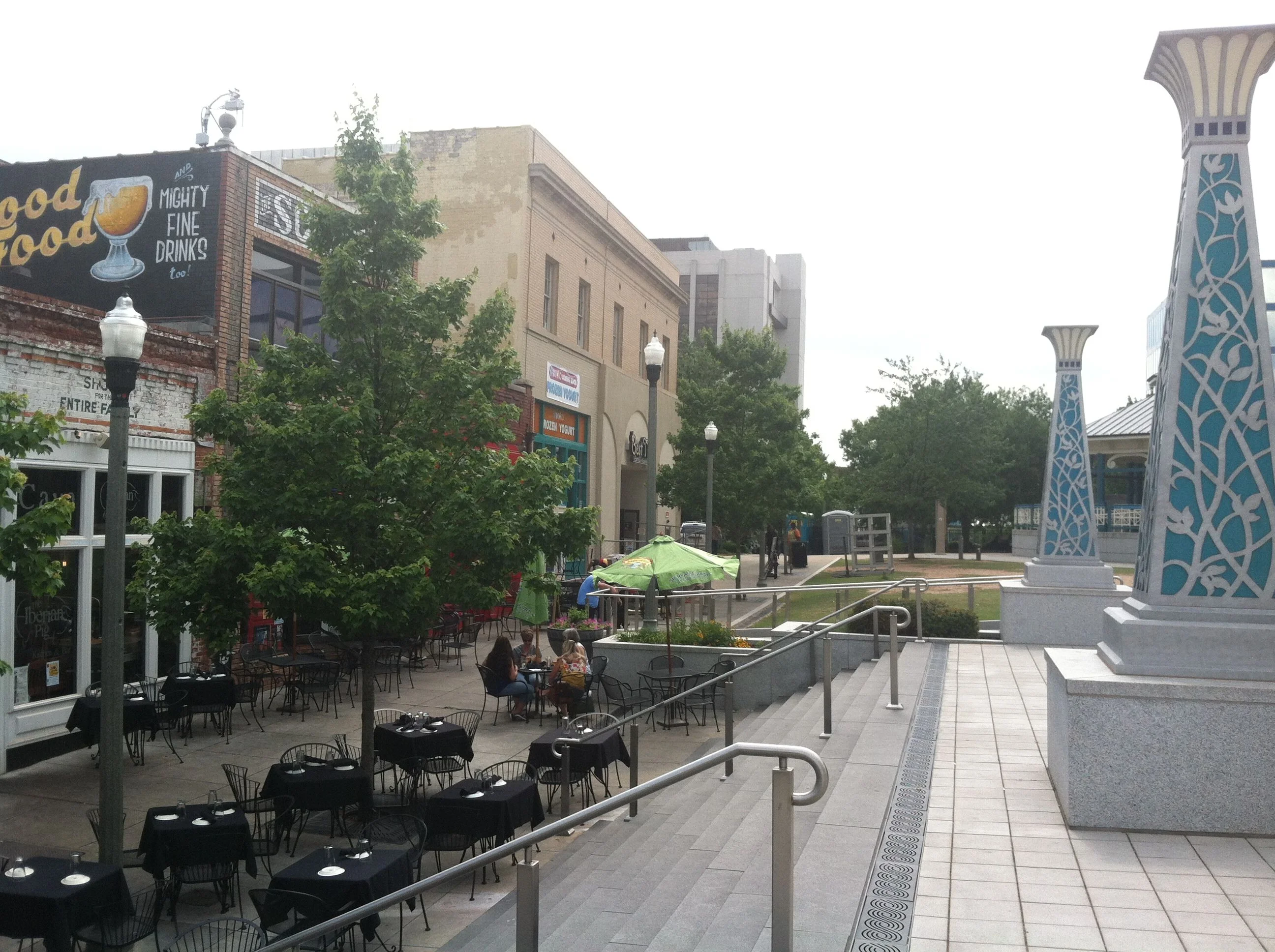
When architects defend designs like this, they weaken their own standing with the public. Contemporary design can and should creatively engage passers-by, and help the feeling that human life is present. More importantly, we should design buildings and spaces that bring joy, beauty, and even whimsy into our existence. It's this sort of intellectualization of building that has caused far more harm than good, as I wrote about previously.
Are we to also accept “Middle-Fingerism” and “Suckitude” as well, if they are presented to us by architects who have names we recognize or win awards?
In the Fall of 2009, the library was listed on the 2010 World Monuments Watch List of Most Endangered Sites. Seriously. That same list includes Machu Pichu and the Taos Pueblo. A building that was on purpose designed to be harsh and inhuman in the 1970’s appears on the same list as those monuments and centuries-old beloved structures.
One of the follies of preservation is that anything of a certain age or style should be saved, regardless of its quality. That’s enhanced even further if a famous designer happened to be involved.
I believe instead that we should value quality and excellence, not saving buildings for the sake of saving buildings. I get the environmental argument, and am all for recycling a building that is basically sound and can be made beautiful.
But, it was right to tear down the Berlin Wall. It’s right to tear down brutal, ugly buildings that repel human life and joy. We have enough dis-spiriting, soul-sucking environments to fix; the last thing we need to do is preserve ugliness in places that actually have a good shot at a future.
If you got value from this post, please consider the following:
- Sign up for my email list
- Like The Messy City Facebook Page
- Follow me on Twitter
- Invite or refer me to come speak
- Check out my urban design services page
- Tell a friend or colleague about this site


