The case for unremarkable buildings
One of the great things starting to happen in cities of all sizes is the redevelopment of neighborhoods lot-by-lot. It’s a phenomenon indicative of a mature development market. The first phase of redevelopment is marked by people occupying inexpensive property and rehabbing it. The second phase involves the bidding up of existing buildings, and the final phase is when a market is ripe enough to support new construction. Of course, each phase presents it’s own challenges as well as opportunities. The primary problem we have in 2013 is that most of us have no reference point for what a mature urban real estate market looks like. As a result, we don’t often know how to react. One hundred years ago it would be a completely ordinary day when a smaller building got replaced by a bigger, more elaborate building. Or, when a residential lot was subdivided so that two more homes could be built upon it. Ho-hum, that’s how cities grow and progress.
But for much of urban America, it’s been fifty years or more since these seemingly unremarkable things have taken place. And so, we have strange things that happen. Urban NIMBY’s fight new development, even though they clamor for more neighborhood retail, more transit and better city services. Zoning codes and city processes make it difficult to build what was ordinary at one time. And architects and developers feel the need to reinvent the wheel as if none of this has ever been done before.
I’d like to make the case for everyone to take a deep breath, and just embrace the building of unremarkable buildings.
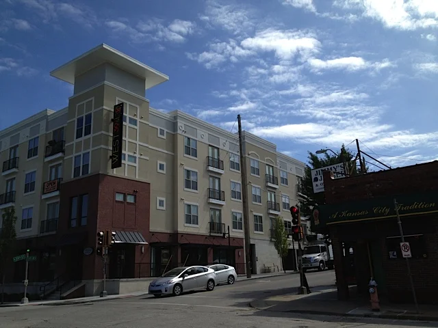
The building below in Kansas City is on a busy east-west street, and replaced a shabby one-story building surrounded by parking. The building won’t win any architectural awards, nor will it be highlighted in tourist bureau marketing. And yet, it’s the kind of building I wish we were seeing by the dozens. It brings over 70 new apartments and some ground-floor retail to a busy corner. The parking is hidden away below, and it even contains a semi-public gathering space in the middle.
Many of my architect friends will snicker at this building, and joke about how it’s a retrograde design with a fake stylistic application. I’d agree that the building could be better – I’d like to have seen better window details, more pedestrian connection on the north-south side and a bit more retail space. But by and large it does what a good urban building is supposed to do, and it does it in a simple, unremarkable manner.
It’s telling also that some neighbors object to the size of the structure. Again, this is revealing as to how little experience we have with redevelopment. Some say that it’s too tall compared to the neighboring buildings that are one and two story. Others object to the number of units on one large site. In a sense, this is the consequence of decades of zoning and design regulations that froze many places in amber. The reasons we put those in place are completely understandable. But honestly, if we can’t have larger buildings on busy streets, where can we? Our cities need density, and much more of it, in order to thrive in the 21st century. Urban residents need to find ways to learn to love more people and bigger buildings. If nothing else, the addition of another 100+ people on this block just helped to make those beloved neighborhood businesses a bit more viable.
In a related matter, I noticed this house the other day on a block in downtown Savannah. The house is new construction, fit snugly in between two other homes. It’s a very simple design, with parking in back and a porch in the front. It’s the kind of thing that we used to build every day when our cities were strong.
Again, the house represents a simple, unremarkable approach to redevelopment. It won’t win any awards, and the local AIA chapter probably doesn’t even know about it. But it’s precisely these kinds of structures that create beautiful streets and attract people to them. They’re the workhorses of our cities, and it’s a shame I even need to highlight their construction.
I’m sure many architects would have preferred a structure with a “contemporary” design in either of these locations. They would argue that a building should respond to its time. I’ve argued before that I’d rather we focus on place instead of abstract concepts like time. After all, what if our time sucks, and I want to change it?
If architects & developers just started focusing on a few critical items, buildings like these examples would get better and better. We could press ahead on important matters such as detailing at the street level, quality materials, quality landscaping, good windows and doors, etc. We’re finally getting the parking in the right place and the building up on the street. We’re starting to do mixes of uses like we used to. We’re learning again about the human experience on the sidewalk.
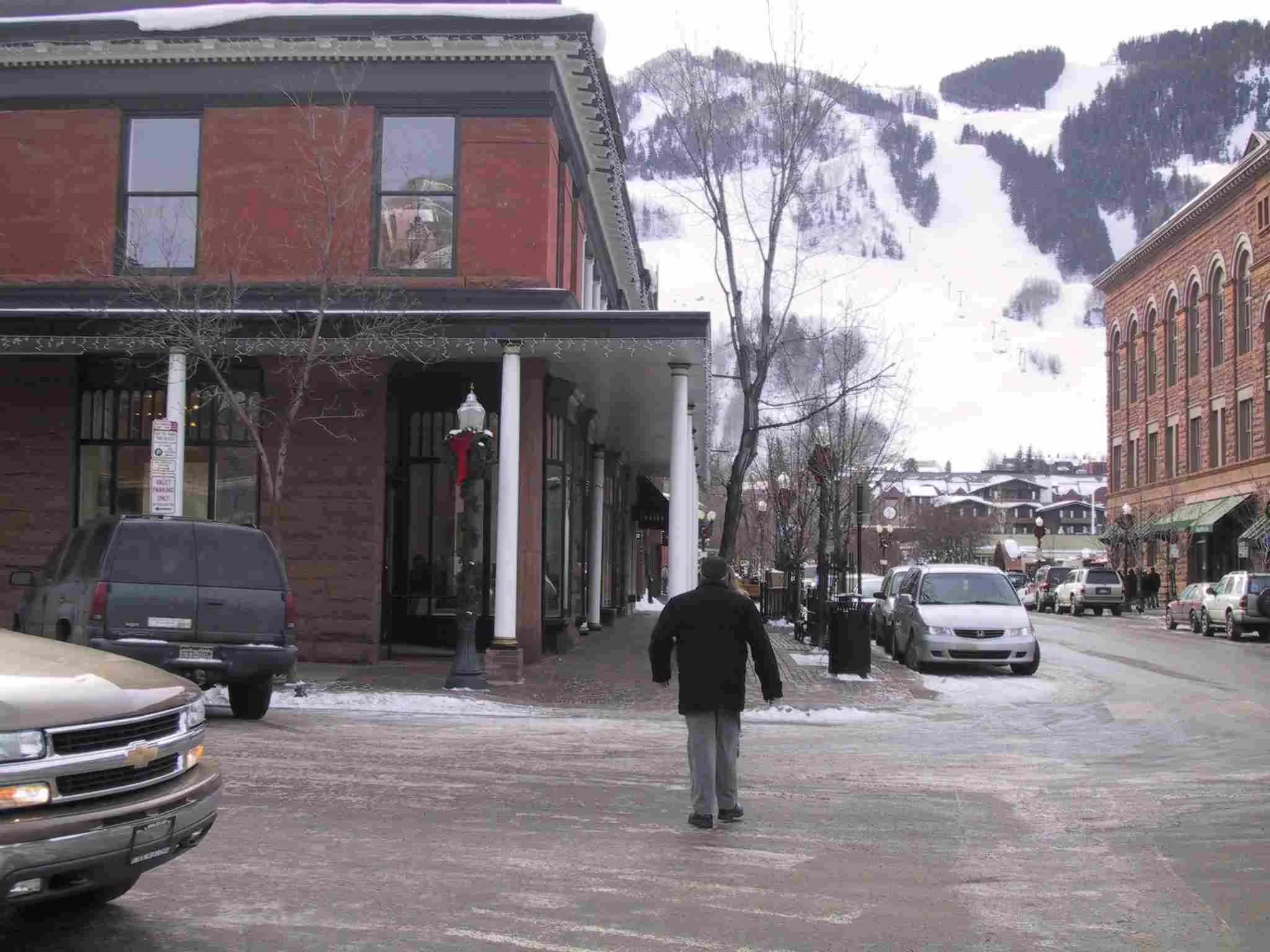
But in truth we still have a long ways to go. These buildings below are indicative of the unremarkable structures designed and built by people in an earlier era. They cared about the simple beauty of buildings, and we collectively cherish what they left us now.
If we could just get past our own blind spots, I believe we can get there again. Our great neighborhoods were not built by an alien race of humans using exotic materials and tools. They simply didn’t have the pseudo-intellectual burden of having to define an age or an all-encompassing desire to be novel. They cared about doing beautiful buildings of substance. And, they had the daily experience of what it meant to live in a living, changing place. I think if we add playfulness and joy to the mix, and focus on the human experience, we’ll find our way through this coming new wave of redevelopment. Take a breath and enjoy the ride.
If you got value from this post, please consider the following:
- Sign up for my email list
- Like The Messy City Facebook Page
- Follow me on Twitter
- Invite or refer me to come speak
- Check out my urban design services page
- Tell a friend or colleague about this site


